Another Mid-Century Style Dining Chair Fabric

Another Mid-Century Style Dining Chair Fabric

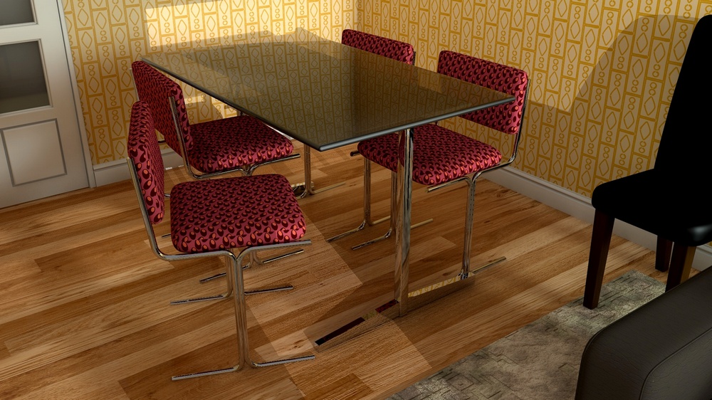
I like designing patterns for chairs because it gives me a chance to think carefully about the use of the pattern that I am creating and about how it will look from the various angles that the chair is seen within the confines of a room.

Although I considered and evaluated the pattern I have used here on several different chairs, I have chosen the simple glass table and chrome chairs that I used before in order to bring this image to you. The pattern is inspired by designs from the 1950s used in the United Kingdom and is intended to be bright and cheerful and at the same time I have tried to make the pattern look as modern as I can. In order to facilitate this, I have changed the wallpaper from that used before to a design which is a little more modern although still based on mid-century ideas.

The colours used on the chair design are from my extended, mid-century palette and are designed to make the chairs themselves look very obvious within the room and, in this particular case, that helps to show them off in what is a slightly darker dining area.

I have also included a little piece of the wallpaper design along with the pattern used for the chairs.

If you wish, you can also see larger versions of this and, of course, my other designs and patterns for interiors on my Flickr page, a link to which is here.

Mid-Century Style Dining Chair Fabric

Looking through a late 1970s catalogue recently, I saw a glass topped table and chrome matching chairs that were exactly the sort of table that I had back in those far off days. Curious as to the fate of glass topped tables, I decided to have a look to see if I could buy one today and I was heartened to find that tables very similar to this were for sale and appeared to be quite popular.

I therefore decided to build one and to create a pattern for the seat cover that I thought would echo the late 1970s but which would also be a suitable pattern for use today. Obviously the design is similar to patterns created during that period and also the colours used are from my extended mid-century palette which gives the seating a noticeable and, I think, very modern look.

Where this table for sale today then I think I would be interested in having this in my own dining room.

If you wish, you can also see larger versions of this and, of course, my other designs and patterns for interiors on my Flickr page, a link to which is here.

50’s Atomic Revisited

The early 1950s, particularly in the United Kingdom, saw a rise in patterns that were based on some of the exciting scientific discoveries which were taking place in the years immediately following the Second World War.

The new crop of talented artists and designers saw these images produced in newspapers, books and on the newly emerging television service and began to incorporate them into their designs. This was a time of hope and excitement for a new decade which revealed itself in bold, interesting and colourful designs.

In the past I have created my version of those designs but, now I am a little older, it is perhaps time to think about the motif and colours again in order to create surface patterns more suitable for today’s wallpaper and fabric.

For this wallpaper I have taken the idea of an atomic motif and tried to make it less colourful and easy to digest for the way that patterns are now used for wall coverings. The room is a dining room although it could equally be a lounge and the wallpaper motif is shown at quite a large scale which I think benefits the size and scale of the room. The colours are mid-century colours although the whole room is intended to be quiet and relaxing.

If you wish, you can also see larger versions of this and, of course, my other designs and patterns for interiors on my Flickr page, a link to which is here.

Green London Apartment Wallpaper

I was experimenting with different colour wallpaper in the London Apartment I used recently and I was surprised at just how different the flat looked with a darker hue.

You can see the difference that it has made with just a change of wall colour and also, so as to look nice, a change of cushion. Everything else, so far as I am aware, is exactly the same but now the interior has a very different feel.

Once again the colours and the pattern owe a lot to mid-century styles and ideas and, I have to be honest, what struck me this time was how liveable in the apartment looked, as if I could just walk into the picture, pick up the book and sit down!

If you wish, you can also see larger versions of this and, of course, my other designs and patterns for interiors on my Flickr page, a link to which is here.

London Apartment Wallpaper

This was a special one-off mid-century style wallpaper that I designed specifically for use in this London apartment set that I had recently created.

The design was intended to look fresh and bright and I created the motif perhaps a little larger than would have been used during mid-century times. The colours, however, are taken from my extended mid-century palette which I think gives the room a period and genuine feel while keeping the whole looking modern.

If you wish, you can also see larger versions of this and, of course, my other designs and patterns for interiors on my Flickr page, a link to which is here.

1970s Wallpaper No2

Rather unusually for me, I had previously created several wallpaper designs for the 1974 room all of which were similar. The idea was to try various wall coverings and see which one of them looked the best within the room. However, now that I have done this I have become quite attached to two of the designs, one of which I showed yesterday.

This design today is a slightly darker colour in order to provide warmth to the room and it also has a markedly bolder pattern in order to make the design more obvious and thus to make the room more mid-century. The colours, of course, are taken from my extended mid-century palette and the design is very reminiscent of the creations that appeared throughout the mid-century period and were designed for those people who wanted mid-century but without the stronger and more unusual patterns that were beginning to appear.

If you wish, you can also see larger versions of this and, of course, my other designs and patterns for interiors on my Flickr page, a link to which is here.

1970s Wallpaper

I decided to keep the living room that I had created much as it was and to see how it worked with a slightly better and a slightly different wallpaper design.

Nothing has been changed other than the wallpaper on the back wall although I have changed the way that the wall looks to create just a little more pattern.

The wallpaper itself is a very mid-century design both in its concept and in its use of colours and I think that this creates a much nicer and a much more pleasing modern room.

If you wish, you can also see larger versions of this and, of course, my other designs and patterns for interiors on my Flickr page, a link to which is here.